Button

What

A button is an element on a page that allows a user to trigger an action.

Why

To provide users a simple way to interact with software

Where

Throughout a UI design

Best Practices

  • Buttons should be large enough to be easily selected and have enough spacing between buttons to avoid users accidentally selecting the wrong button.
  • Buttons in mobile designs should be larger as users fingers are effectively larger than a cursor on desktop. 44px by 44px is a good minimum size for mobile buttons.
  • If there are more than one button in a section, one should be the primary or preferred action and should be more prominent. The secondary or less preferred actions should have less prominent buttons.
  • Button labels should be legible, concise and indicate what will happen when the button is pressed.
  • Having some sort of visual change (like a different background color) when a button is pressed will help a user know that the button has, indeed, been successfully pressed.
  • A “hamburger” is a button with three horizontal lines and indicates a hidden menu
  • A “more button” is a button with three dots stacked vertically (or the text “more” or “see more” only).

Related Principles

Design Systems

Design Systems

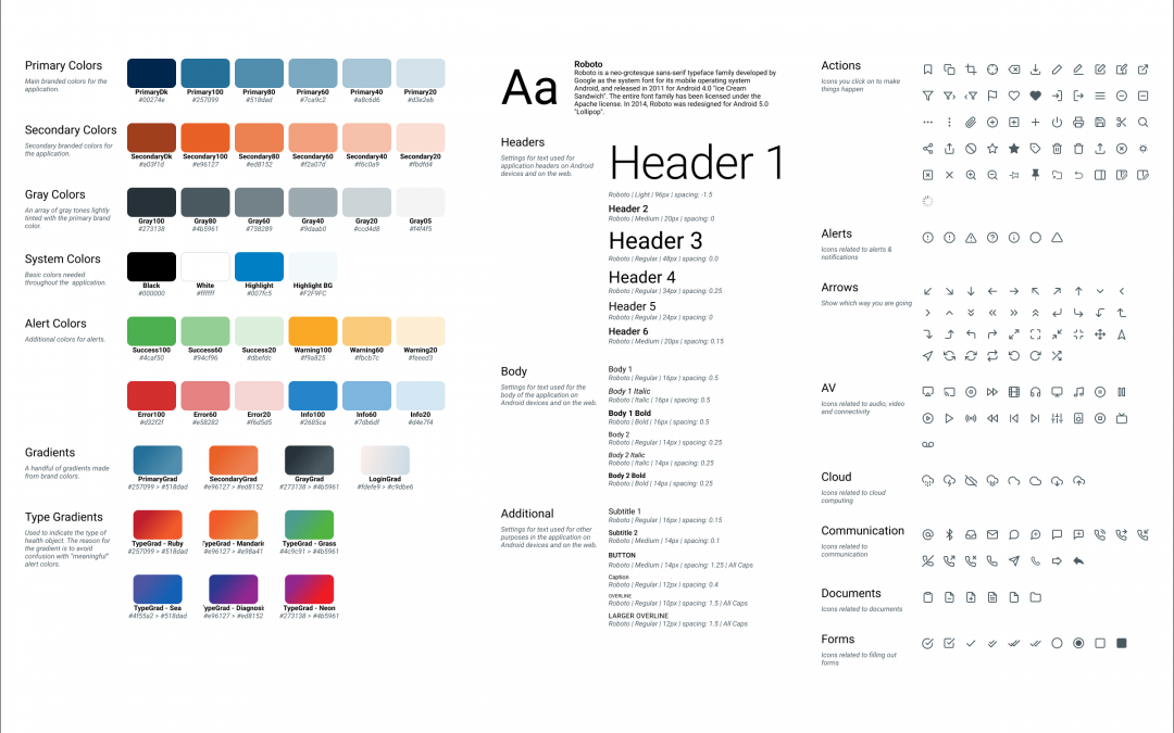
A design system is a set of design standards for a company or a specific project. The primary elements of a design system are: color & text styles, icons & illustrations, and commonly used components. It can also include things like code standards, layout...

UX/UI Design Glossary

UX/UI Design Glossary

Chrome Visual elements that provide users information about or commands to use the screen's content. Chrome is not part of the content itself. Examples would be buttons, labels, and menus. Edge Case An uncommon situation when a user's experience falls outside the...