Controls: Check box, Radio, Segment, Toggle

What

Controls are elements that allow users to change or choose something from more than one option.

Why

To provide an easy way to change content or send data

Where

Often at the top of a section of content

Best Practices

Control best practices

  • Most lists of options for controls display better vertically than horizontally
  • Controls usually change settings or views rather than triggering an action

Toggles

  • Toggle changes should take effect immediately and visually indicate a change has been made
  • Toggles should mimic a switch in the real world
  • Toggles should only have 2 options: on and off

Radios

  • Radios should be a circle that is filled or not filled
  • Radios should only allow one option to be selected and they should start on a default option

Checkboxes

  • Checkboxes should be squares that have a check mark or X when they are selected
  • Checkboxes are used when the selection is optional and/or when multiple items can be selected
  • Multiple checkboxes are not mutually exclusive

Segments

  • Segment controls are toggles with more than two options

Related Principles

Design Systems

Design Systems

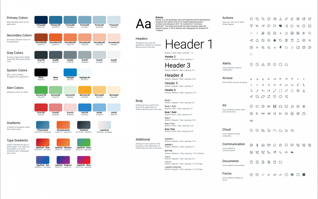
A design system is a set of design standards for a company or a specific project. The primary elements of a design system are: color & text styles, icons & illustrations, and commonly used components. It can also include things like code standards, layout...
UX/UI Design Glossary

UX/UI Design Glossary

Chrome Visual elements that provide users information about or commands to use the screen's content. Chrome is not part of the content itself. Examples would be buttons, labels, and menus. Edge Case An uncommon situation when a user's experience falls outside the...