Most user interfaces for an app or website have required fields somewhere in the design. Usually found in a form or somewhere else a user might input data into a text field. The design, settings, rules for an error field, when done correctly, can reduce a user’s frustration when using a UI.
Principle 1: Why can’t I skip this?!?!
It’s important to very carefully consider which fields are required. There are few things more frustrating for a user than not being able to continue a process through no fault of their own. There are usually a lot of use cases for a UI and it is important to consider the various reasons a user might not know what to enter in a required field. An example would be requiring a social security number. Do all of your users definitely have a SSN? Some people don’t. For instance, newborn babies don’t get an SSN until about 3 weeks after they’re born, but often have their first doctor’s visit before 3 weeks old.
Whenever possible it’s a good practice to have the ability to skip a required field. This helps against a use case you haven’t thought of. The interface can always warn someone before they go forward in the process that they’ve skipped a required field without blocking them from advancing.
Principle 2: Don’t yell at me, I’m not done yet!
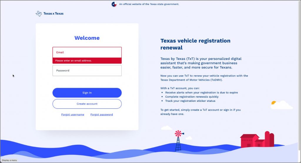
Another frustrating situation for a user is when a UI starts warning them about not meeting the rules for a required field before they’re even done typing. This happens a lot with creating a password and it is not a friendly way to interact with users. Red colored text or UI elements are meant to imply that something was done incorrectly, not simply partially complete. A better way to use red text, outlines, or backgrounds is to wait until the user validates the field by pressing a button or trying to move forward in some other way before warning them about a rule not being met.
Principle 3: Where do we go from here?
After presenting the error message at the correct time and instance, giving some instructions on what to do next is also very helpful. A warning that pops up and says “Your password needs to be changed” is better than simply not letting someone login. However, an optimal solution is to provide a link in that same pop-up to change the password now, or even better would be to navigate them straight to a password reset window with the cursor on the first field. Helping the user recognize and diagnose an error is good. Helping them recognize, diagnose, and recover is even better. That is also, #9 of Nielsen Norman Group’s 10 Usability Heuristics.
Principle 4: I know something is wrong, I’m just not sure what.
A quick and easy way to make the user journey more usable is to place the error message as close to the error itself as possible. If the field with an error is at the top of the screen, don’t put the error message at the bottom. It’s annoying to users. Just don’t do it.
Other Principles:
Don’t only use color as an indicator.
Over 350 million people around the world are color blind. Use some sort of shape, icon, or outline change to indicate something is wrong.
Use color based on severity of the problem.
Use red when it is especially important for the user to address an issue. Use yellow or another color when you want to warn them about something that isn’t crucial (like “Shipping is taking longer during the holidays, your item may to up to 2 weeks to get there”).
Don’t blame the user.
Avoid phrases like “You did” or “You didn’t”. Instead simply state what should be done instead. The user might already be frustrated by the interruption of an error, don’t make it worse by blaming them.
Use concise, simple language
Don’t say please. That implies there is a choice.
Don’t say Oops or use jokes. Users are already frustrated by errors. Again, don’t make it worse.
Be concise, don’t use technical jargon and be prescriptive in the text of the error message.