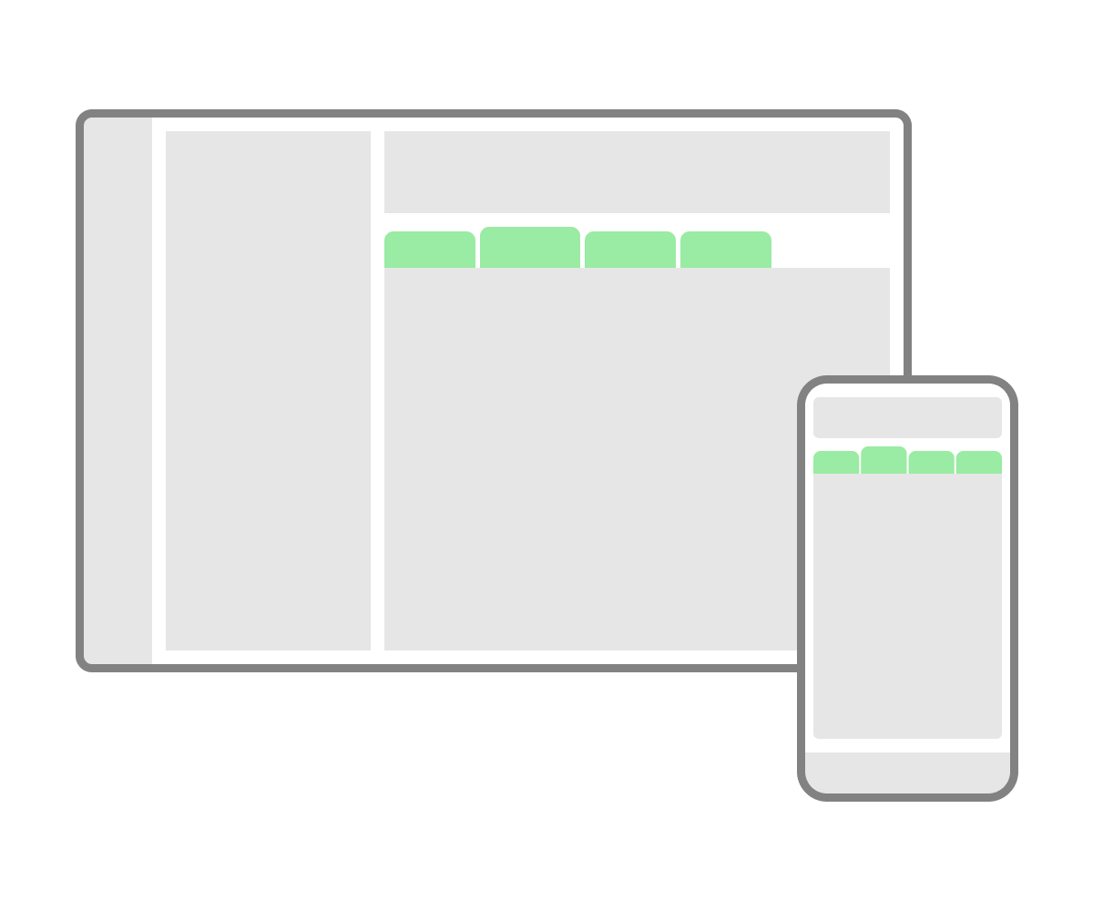
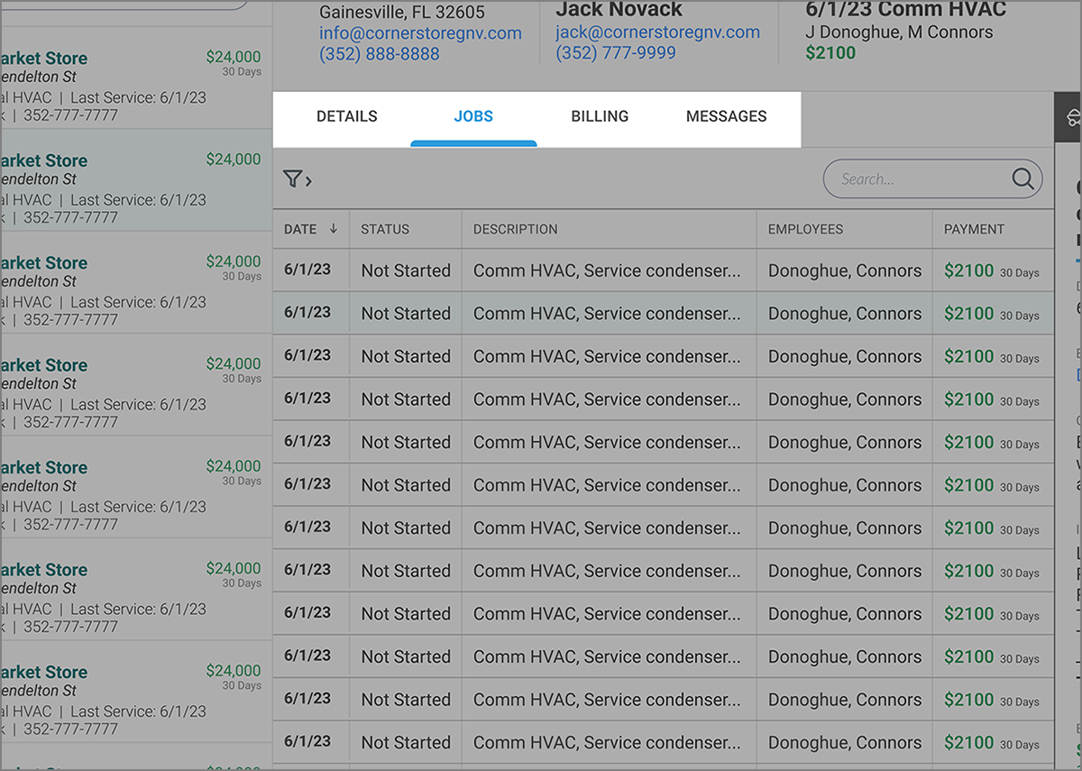
Tabs are controls at the top or side of a section of a page that resemble tabs from a file folder.
To organize content and allow a user to easily switch which content is visible.
Typically at the top, or along the side, of a section of content
- Use tabs to switch views, not navigate to a different context altogether.
- Don’t use tabs when the user will need to see more than one view at the same time. In other words, if the content viewed with “Tab A” needs to be seen at the same time as “Tab B”, don’t use tabs.
- Make the currently selected tab prominent in some way to make it obvious which tab is selected.
- Use plain language and 1-2 words at most.
- It’s best to not have more than one row of tabs.