A design system is a set of design standards for a company or a specific project. The primary elements of a design system are: color & text styles, icons & illustrations, and commonly used components. It can also include things like code standards, layout & spacing guidelines, and accessibility considerations. The main purpose of a design system is to provide consistency throughout a project or all of a company’s projects.
Every digital project (app, website, major feature added to either) should either have its own design system, conform to the company-wide design system or use an external design system.
Some well known examples of design systems are:
Material Design System by Google
Human Interface Guidelines by Apple
Fluent Design System by Microsoft
Elements of a Design System
Color
A design system should include swatches and hex codes of at least a primary and secondary color that will be used throughout a design. Including shades of those colors also helps. More colors can be added, but primary and secondary are the baseline.
Other colors to include are the exact hue of: red for error states, green for success states, blue for links, black or dark gray for text and other grays (for things like borders). Including a range of grays is helpful for many parts of a design.
It helps to name each color (even if it’s “Gray 1”), rather than just referring to a color by its hex code.
As with all aspects of a successful design, consistency is important with color use. This will help a user know what to expect as they are moving through a digital product.
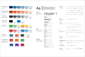
An example of a color guide in a design system. This is a larger example, a design system doesn’t have to contain this many colors.

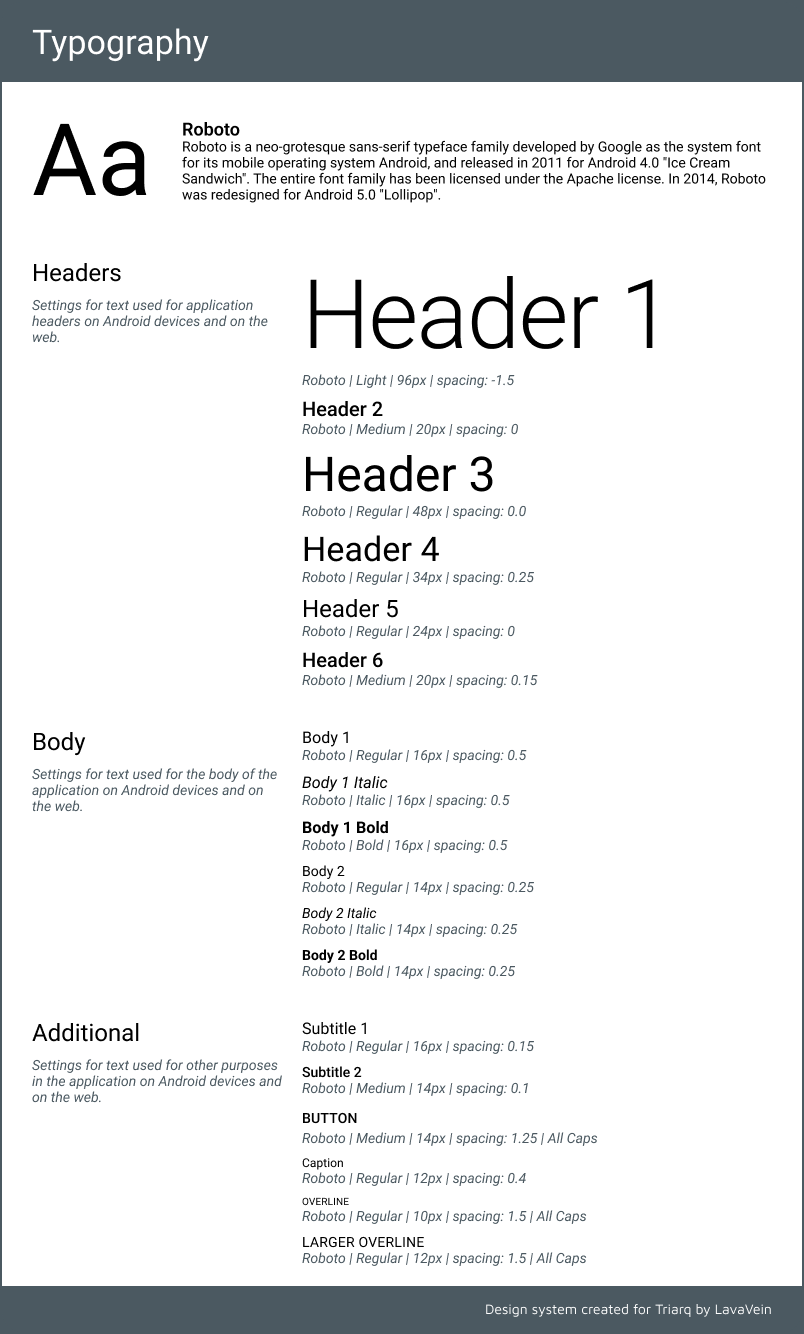
Text
A design system should include 1-2 fonts and when to use them. It should also give sizes, weights, and spacing for specific uses.
When choosing text styles keep the following best practices in mind:
Legibility and consistency
Legibility and consistency are the most important traits of the text in a digital product. It doesn’t matter how pretty a font looks if no one can read it (or if it slows them down to read it quickly). Size, weight, spacing, and color all affect legibility. Consistency in when a heading or body size is used helps a user subconsciously learn a pattern and scan text more easily.
Context
It’s important to keep the context of a product in mind when choosing a font. For example, a fun, exuberant script would not be appropriate for a formal or clinical setting.
Visual Hierarchy
The size, weight, spacing and color of text all point to a larger visual hierarchy within a design. Heading sizes should only be used sparingly and only for short pieces of text like category labels. Body text should be used in longer areas of text. Adding color, a larger size or increasing the weight of a piece of text will imply greater importance.
Visual Hierarchy Example:
Subsection 1
Standard sentence in the body text font and size. Important idea that shouldn’t be missed!
Subsection 2
More body text with an emphasis on this word and this one.
Although, keep in mind that users tend to expect blue text to indicate a link.
An example of a Type Scale:
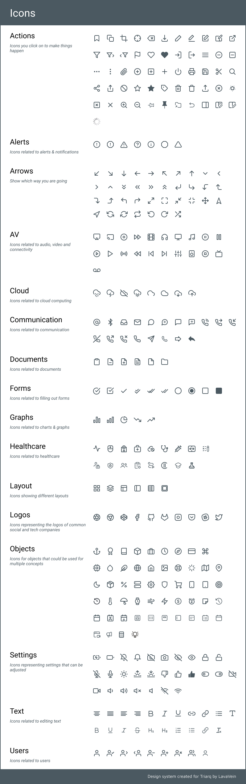
Icons
Icons should be easily recognizable simple illustrations that represent real world objects as much as possible. Creating icons is not the time to try and reinvent the wheel. The point of an icon is to say something without using text. For example, in the real world (at least in the United States), a red octagon is going to bring to mind a stop sign for most users. It is far too ingrained already to try and change the association.
An icon set example from a design system:
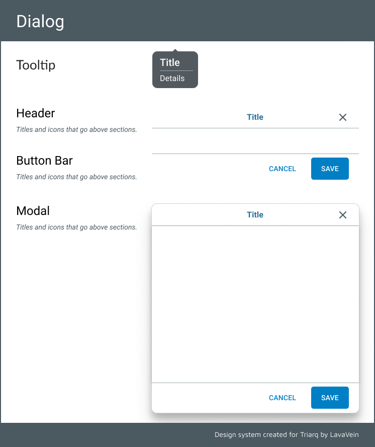
Common Components
A design system may also include components that might be found multiple times throughout a product. This includes things like inputs (radios, checkboxes), menu styles, modals or widgets. The idea here is to ensure consistency and to speed up the design process by providing components that can be reused.
An example of components from a design system:
Final thoughts about design systems
Design systems are a guide to help designers with efficiency and consistency in a design. The larger the design gets, the more useful a design system is. If you didn’t create one at the beginning of your project you can always go back and add one later if it will help. Design systems are also living documents. They are changed often and shouldn’t be something that restricts the design process.
*Also, something to note is that some design systems include code examples and guidelines for developers.