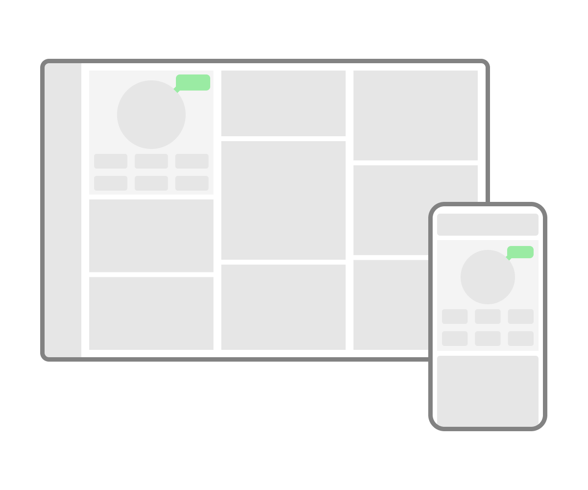
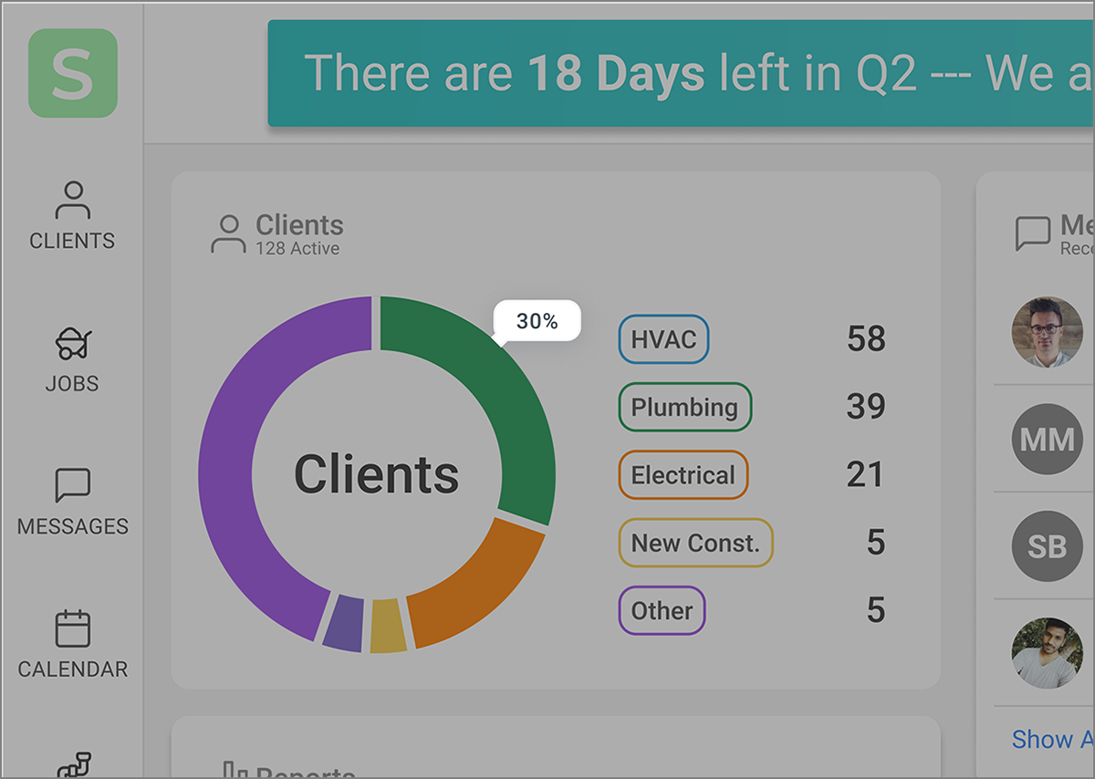
A tooltip is a temporary pop up window that explains something that would be important to users, but might not be obvious to everyone
To help some users with information that doesn't fit elsewhere in the visible design
Typically next to a label or other text field, denoted by a small icon or short text
- Should be shown when user clicks on icon or mouse hovers over icon
- Shows information about the “paired element” it is close to
- Shouldn’t be used for vital information.
- Should be for edge cases.
- Should be very brief and helpful. Don’t include information already visible on the page.
- Include an arrow if there are multiple icons the tip could be pointing to.
- Be consisitent with tooltips throughout site or app
- Can be helpful for unlabeled icons